norman.comfort@getcomfortable.co.uk, or talk to me on 07530 708125. Let's do this.....
The Power of Wine Labels: How Design and Controversy Shape Consumer Choices
Wine is an experience, a story, and often, an expression of family history, culture, and a sense of place. The label on a wine bottle can be incredibly influential in determining whether a consumer picks it up from the shelf. That initial decision to try and ones perception of the wine and the wine maker are frequently influenced by the label’s design.
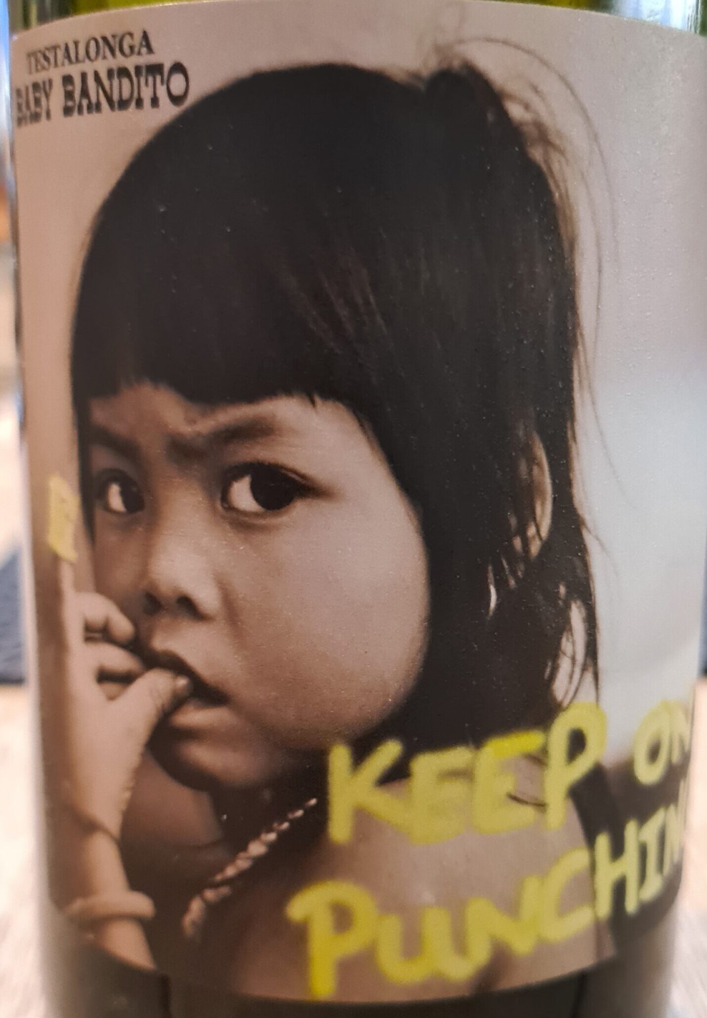
In recent years, many smaller wineries and natural winemakers have begun to experiment with bold, controversial labels as a way to stand out and attract their audience. This trend is particularly noticeable in independent retail stores, where eye-catching designs can dramatically affect shelf displays and consumer choices.
The Impact of Wine Labels on Consumer Choices
For many consumers, the wine label is the first point of contact with a new wine. It’s a visual representation of the wine’s personality, conveying everything from its flavor profile and quality to its heritage and the philosophy of the winemaker. A well-designed label can evoke emotions, tell a story, and ultimately, influence a purchase decision. However, there is plenty of potential for the label itself to be misunderstood or misinterpreted by the consumer.
In the competitive world of wine, particularly in independent retail stores where space is limited and choices are abundant, labels play a crucial role in attracting attention. Natural wine producers are recognised for perhaps pushing the boundaries of wine label designs. But does this artwork satisfactorily convey the wine inside the bottle? By using provocative, controversial, or unconventional labels, these winemakers aim to stand out in a crowded marketplace and appeal to a specific audience—often younger, adventurous drinkers who are drawn to products that break away from tradition.
Controversial Wine Labels: A Bold Move
Controversial wine labels have become a talking point in the industry, sparking both intrigue and debate. These labels often feature striking imagery, bold colors, and sometimes even provocative or humorous content. While they may alienate some traditional wine drinkers, they can be highly effective in attracting attention and creating a memorable brand identity.
Here are a few examples of controversial wine labels from recent years:
-
“Some Young Punks”: An Australian winery known for its daring labels, Some Young Punks use artwork that is often inspired by comic books and pulp fiction covers. Their labels are colorful, vibrant, and unapologetically bold, with names like “Passion Has Red Lips” and “Naked on Roller Skates.” The provocative nature of these labels appeals to a younger audience looking for something different and fun.
-
“19 Crimes”: This brand tells the story of British convicts who were sent to Australia in the 18th century. Each label features a different “crime” that would have resulted in transportation to Australia, along with an image of a convict. The labels are designed to look aged and weathered, adding to the historical narrative and creating a sense of intrigue and storytelling that captivates consumers.
-
“If You See Kay”: This wine label and the wineries marketing materials use edgy typography and the rebellious persona of Kay to challenge audiences. It’s a bold marketing move that grabs attention and has been particularly successful on social media.
Comparing Modern and Classic Wine Labels
To understand the stark contrast in wine label design, consider a modern wine label from a small natural wine maker with a classic older Bordeaux.
Modern Natural Wine Label:
Take, for example, a bottle of natural wine from a small producer like Gut Oggau from Austria. The labels feature illustrated portraits representing fictional family members, each with its own personality that reflects the style of the wine inside. The artwork is minimalist yet striking, with a contemporary design that resonates with the natural wine community’s values of creativity, individuality, and authenticity.
These labels are often hand-drawn or designed to look handcrafted, emphasizing the artisanal nature of the wine. They might use non-traditional color schemes, such as pastel or neon hues, and avoid the typical iconography of classic wine labels. The label tells a story, inviting the consumer to connect with the character and, by extension, the wine.
Classic Bordeaux Label:
In contrast, a classic Bordeaux, such as a Château Margaux, features a label that speaks of tradition, heritage, and sophistication. The design is often minimalist, with a focus on elegance and simplicity. The font is typically serif, exuding a sense of history and formality. The color palette is restrained, often using deep reds, blacks, or golds to convey luxury and quality.
These labels often include images of the chateau itself, along with detailed information about the wine’s origin, the estate’s history, and the vintage. The overall effect is one of tradition and reliability, appealing to consumers who value reputation and consistency in their wine choices.
The Future of Wine Labeling
The trend towards more experimental and controversial wine labels reflects a broader shift in consumer preferences. As younger generations become more prominent in the wine market, there is a growing demand for products that are not only high-quality but also visually appealing and representative of contemporary values. But does this override the quality and flavour profile of the wine inside? If so, is this really positive?
For small wineries and natural winemakers, embracing bold and unconventional label designs can be a powerful way to differentiate themselves and attract a dedicated following. Older more established wineries find this difficult to deal with when considering label designs for their next harvest.
In the end, the power of a wine label lies in its ability to tell a story, evoke an emotion, and ultimately, make a connection with the consumer. Whether through controversy, artistry, or tradition, labels will continue to play a crucial role in shaping the wine industry and influencing consumer choices for years to come.
One of my favourites!